
When designing a website, precision in layout, typography, and responsiveness is essential. Measurement units are the backbone of achieving a visually appealing and functional web design. This guide explores the various absolute and relative units used in web development, helping you choose the right one for your projects.
Why Units Matter in Web Design
Units determine how elements like text, images, and containers are sized and spaced. Choosing the appropriate unit impacts:
- Consistency: Ensures uniformity across devices and screens.
- Responsiveness: Allows layouts to adapt gracefully to different screen sizes.
- User Experience: Proper sizing improves readability, usability, and visual balance.
- Absolute Units
Absolute units are fixed and don’t scale with the viewport or parent elements. They offer precision but lack flexibility in responsive designs.
- Pixels (px)
- Represents a single dot on the screen.
- Ideal for: Fixed-width designs, borders, and small spacing.
- Example:
- Pro Tip: Use pixels sparingly in responsive layouts.
- Physical Units (cm, mm, in)
- Based on real-world measurements.
- Rarely used in web design, mainly for print styles.
- Example
- Points (pt) and Picas (PC)
- Originating from print design, 1pt = 1/72 inch, and 1pc = 12pt.
- Example
- Best avoided in modern web design due to better alternatives like px and rem.
- Pixels (px)
- Relative Units
Relative units are dynamic and adapt to their context, making them essential for responsive designs.
- Percentages (%)
- Relative to the parent element’s size.
- Ideal for: Creating fluid layouts that adapt to screen sizes.
- Example
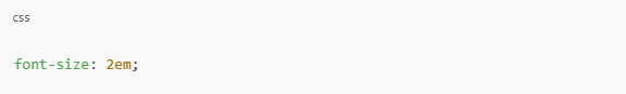
- em
- Relative to the font size of the parent element.
- Ideal for: Scalable typography and nested element spacing.
- Example
- rem (Root em)
- Relative to the root element (
<html>) font size. - Ideal for: Consistent typography across components.
- Example
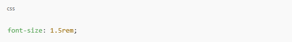
- Pro Tip: Use rem for global scaling and avoid nesting issues common with em.
- Relative to the root element (
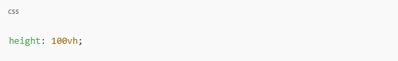
- Viewport Units (vh, vw)
- vh: 1% of the viewport height.
- vw: 1% of the viewport width.
- Ideal for: Full-screen layouts or dynamic resizing.
- Example
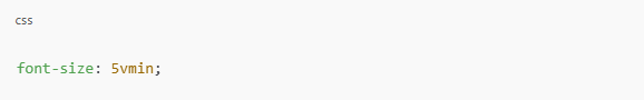
- vmin and vmax
- vmin: 1% of the smaller dimension (width or height).
- vmax: 1% of the larger dimension.
- Ideal for: Scaling elements proportionally to viewport size.
- Example
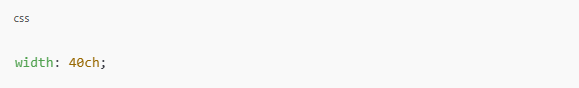
- ch (Character Width)
- Based on the width of the 0 character in the font.
- Ideal for: Setting line lengths for better readability.
- Example
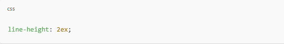
- ex (x-Height)
- Based on the height of the lowercase x in the font.
- Rarely used but can be helpful for typographic adjustments.
- Example
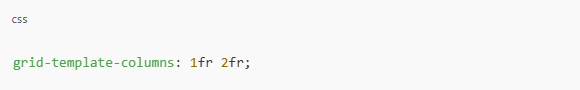
- fr (Fractional Unit)
- Used in CSS Grid to divide available space.
- Ideal for: Creating flexible grid layouts.
- Example
- Percentages (%)
How to Choose the Right Unit
- For Layouts:
Use % for fluid layouts and fr in grid systems. - For Typography:
Use rem for global font sizing and em for scalable components. - For Spacing and Borders:
Use px for small, precise adjustments. - For Full-Screen Elements:
Use vh and vw to make sections span the entire viewport. - For Responsive Designs:
Combine vw, vh, rem, and % for adaptability.
Final Thoughts
Understanding the strengths and limitations of each unit helps you create designs that are visually consistent, responsive, and user-friendly. While absolute units like px provide precision, relative units like rem, %, and viewport-based units (vh, vw) offer the flexibility needed for modern web design.
By choosing the right unit for the right context, you can build websites that look stunning and perform seamlessly across devices. Keep experimenting and refining your designs to master the art of using units effectively!


46 Responses
Thank you for such an easy-to-understand guide! I’m definitely applying these techniques in my upcoming projects.
Thanks a lot, William! I’m glad you found the guide useful. Looking forward to seeing how you apply these techniques in your projects!
Understanding the nuances of CSS units has always been challenging. This post clarified many of my doubts, especially regarding the use of percentages in layouts.
Great to hear, David! Percentage-based layouts can be confusing at first, but once you understand how they behave, they can be incredibly powerful. Keep experimenting!
This article is a must-read for anyone looking to enhance their web design skills. The insights on using ‘vh’ and ‘vw’ units were particularly helpful.
Yes! ‘vh’ and ‘vw’ are essential for modern responsive design. I’m glad you found this useful, Daniel. Keep pushing your web design skills forward!
The examples provided made it easy to grasp complex concepts. I appreciate the practical approach and the emphasis on best practices.
Thank you, Emily! I believe real-world examples help simplify complex concepts. I appreciate your feedback!
I’ve bookmarked this page for future reference. The detailed explanations and practical tips are exactly what I needed to improve my designs.
That’s fantastic, Laura! Bookmarking helpful resources is a great habit. Thanks for your kind words, and I hope this guide continues to help you!
The comparison between different units and their impact on responsive design was eye-opening. This will definitely influence how I approach my projects.
Absolutely, James! Measurement units play a huge role in making designs adaptable. Thanks for your feedback, and keep creating great designs!
As someone new to web design, this guide was incredibly helpful. The straightforward language and real-world examples made complex topics accessible.
Thanks, Christopher! It’s awesome to hear that the guide was helpful for you as a beginner. Keep learning, and don’t hesitate to ask questions!
Thank you for shedding light on the practical applications of various CSS units. The clarity and depth of this article are commendable.
I appreciate that, Sophia! Practical applications are the key to mastering web design. Glad you found this post valuable!
I finally understand the difference between px, em, and rem! This guide is so well-explained and easy to follow. Thanks for sharing your expertise.
Glad to hear that, Olivia! Understanding the differences between px, em, and rem is a game-changer. Thanks for your feedback!”
This article cleared up a lot of confusion for me. The use of viewport units in responsive design is a game-changer. Keep up the great work!
Thanks, Ryan! Viewport units are indeed a game-changer for responsive design. I appreciate your support!
I appreciate the detailed breakdown and examples. It’s refreshing to see such well-organized content. Looking forward to more posts like this!
I’m so happy you found it well-organized, Hannah! I always aim for clarity and practicality. Stay tuned for more content!
Such an insightful post! I had been using pixels for everything, but now I see why relative units are better for responsiveness. Thanks for the clarity!
Glad you found it helpful, Ethan! Relative units really make a difference when it comes to responsive design. Keep experimenting, and feel free to ask if you have any questions!
I’ve read a lot about CSS units, but your explanations and examples really made things click for me. Thank you for this valuable resource!
Thank you, Ava! I’m so happy to hear that the post helped clarify things for you. Stay tuned for more web design tips!
The part about percentages vs viewport units was eye-opening. This will help me make my designs more scalable. Great job!
Yes! Understanding the difference between percentages and viewport units can really change the way we design layouts. Thanks for your feedback, Jacob!
I never realized how much of a difference using rem instead of px could make. Your post has helped me improve my workflow tremendously!
Absolutely, Lily! Using rem instead of px can make a huge difference in accessibility and consistency. Appreciate your kind words!
This was exactly what I needed! I was struggling with flexible layouts, and now I feel more confident about using the right measurement units.
That’s awesome, Mason! Flexible layouts can be tricky, but once you understand measurement units, everything starts making sense. Keep up the great work!
I love how you explained this in such a beginner-friendly way. I’m bookmarking this for future reference!
Thank you, Isabella! My goal is to make web design concepts easy to understand, so I’m glad this post was helpful to you!
I always wondered why some websites scale perfectly while others don’t. Now I know it’s all about choosing the right units. Thanks for sharing
Exactly, Benjamin! Choosing the right units is a crucial step in making websites truly responsive. Appreciate your feedback!
The examples made all the difference! Learning about ‘vw’ and ‘vh’ was especially helpful. Keep up the great content!
So happy to hear that, Charlotte! ‘vw’ and ‘vh’ are game-changers for full-screen and fluid layouts. Thanks for reading
CSS units always confused me, but now I finally get it! Your explanations are super clear and practical. Looking forward to more posts like this
That’s wonderful, Mia! CSS units can be confusing at first, but once you understand them, designing becomes much easier. Stay tuned for more content!
The breakdown of different CSS units and their applications is invaluable. I’ll be referring back to this article frequently as I work on responsive designs.
Thanks, Jessica! I wanted to provide a resource that’s easy to reference, so I’m glad you found it helpful. Keep designing awesome layouts!
I’ve always struggled with choosing the right units in my designs. This post demystified the process and offered practical advice. The section on viewport units was especially useful.
Happy to hear that, Michael! Choosing the right units can be tricky, but once you get the hang of it, everything becomes more intuitive. Thanks for reading!
This article provided a clear distinction between absolute and relative units. The examples illustrating when to use ’em’ versus ‘rem’ were particularly enlightening. Thank you for this comprehensive guide!
Thank you, Sarah! I’m glad you found the comparison useful. Mastering measurement units is key to effective web design—keep up the great work!